AIO Launcher
- 4.5
- Rating
- 1.00M
- Installs
- Free
- Price

 Analysis by App-foxy
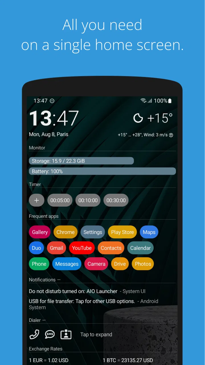
Most Android launchers ask me to think in terms of icons, pages, folders, and visual themes. AIO Launcher takes a different route. It treats the home screen more like an information panel, putting useful details and shortcuts into one compact space instead of spreading them across several screens. After using it, I found that its biggest appeal is not decoration but reduced searching: the phone feels more like a personal dashboard than a shelf of app icons.
That approach makes the app interesting for anyone who wants a calmer, more direct way to reach common tasks. It can also help people who find crowded grids tiring or who prefer text and organized information over tiny symbols. At the same time, this is not a universal accessibility solution. Its unusual layout takes adjustment, and people who rely on familiar icon placement or highly visual customization may feel less comfortable at first.
How AIO Launcher changes the home-screen experience
Developed by AIO Mobile Soft, this free personalization app is built around the idea of keeping important information on a single home screen. That sounds simple, but it changes how I use my phone. Rather than swiping through pages to find a weather widget, calendar entry, or application icon, I can work from one vertically organized view and move through it with a more deliberate rhythm.
You May Also Like

 Blood Strike: 2.5 Anniversary
Blood Strike’s Loadouts Turn Every Drop Into a Tactical Gamble
A close look at Blood Strike’s custom loadouts: how fast access to signature weapons reshapes its battle royale rhythm, rewards preparation, and narrows the gap between fights.

 Pandora - Music & Podcasts
Pandora’s Music Is Easy to Start, but Harder to Recover
Pandora’s strength is its low-effort path from a seed to a station. Its weak spot is how much confidence it asks you to place in connection, setup, and quiet recovery.

 8 Ball Pool
 Is Built on Rivalries, Rematches, and Routine
A close look at the rivalries, rematches, shared routines, and unanswered safety questions that turn a quick pool match into a persistent mobile community.

 Samsung Music
’s Quiet Strength Is Playing What You Already Own
Its reach comes less from spectacle than from dependable access to a personal library. That simplicity is both the app’s strongest retention engine and its ceiling.

 AccuWeather: Weather Radar
AccuWeather Review: A Quick, Clear Forecast for Everyday Decisions
For everyday plans, the best forecast is the one you can understand quickly. AccuWeather makes rain timing, radar, and local conditions easy to act on, with a few trade-offs.

 Hill Climb Racing
Why Hill Climb Racing Still Turns Crashes Into One More Run
A tiny car, a bumpy hill and one more upgrade: Hill Climb Racing keeps resurfacing because its simple chaos makes every near-miss feel personal.
More From Our News Desk



The result is especially useful when I want to glance at the phone rather than explore it. A conventional launcher can look cleaner when it has only a few carefully chosen icons, but it often requires remembering where each shortcut lives. AIO Launcher trades some visual familiarity for density and direct access. I see more information at once, although the screen can initially feel busier than a minimalist icon-based setup.
The app has been available since November 4, 2017, and its current version is 7.4.2. It has built a substantial audience, with more than a million installs and an average rating of 4.5 from roughly seventeen thousand ratings. Those figures do not replace personal testing, but they do fit my impression that this is a mature alternative rather than an experimental home-screen concept.
Readability depends on how you organize the panel
For me, the strongest readability benefit comes from the launcher’s information-first structure. Text labels and grouped content can be easier to interpret than a wall of similar icons, particularly when I am trying to identify something quickly. A person who remembers words more easily than symbols may find this arrangement more understandable than a standard launcher.
There is a trade-off. Putting many categories on one screen can create visual competition. If I allow too much information to remain visible, the page stops feeling calm and becomes a long stream that demands scanning. The practical lesson is to treat the home screen as a working surface, not a storage area for everything. Keeping only the sections I check regularly makes the layout much easier to read.
I also found that the launcher rewards consistent ordering. If I place the most important information near the top and leave less urgent sections lower down, I develop a predictable scanning route. That is more useful than changing the arrangement every few days for cosmetic reasons. The app’s strength is its stable overview, so constant rearrangement works against it.
Compared with a typical Android launcher, AIO Launcher is less immediately recognizable. Standard launchers usually let me identify an app by its familiar logo and position. Here, I need to understand the structure and use labels or the launcher’s navigation approach. That can be a positive for people who struggle with icon recognition, but it may slow down someone who has spent years relying on muscle memory.
Navigation favors deliberate gestures over decorative pages
I would recommend spending time learning the home screen before judging it. The first session can feel less obvious than opening a conventional launcher, because the app does not simply present the usual grid and ask me to tap an icon. Once I understand where information and shortcuts are placed, the reduced number of separate pages becomes a real advantage.
This matters for people who lose track of location while swiping. A single main surface gives me fewer places to search, and that can reduce the mental effort involved in finding a routine task. It is also helpful when I am distracted, carrying something, or checking the phone in a hurry. I do not have to remember whether a shortcut was placed on the second page or inside a folder.
On the other hand, users who prefer a large, spacious layout may find the information density tiring. AIO Launcher is not the best choice if my ideal home screen is a photograph, a few oversized icons, and almost no text. In that situation, a conventional launcher with adjustable icon size and a simple dock may feel more comfortable.
Motor and sensory needs require a personal setup
From a motor perspective, fewer pages can mean fewer repeated swipes and less hunting. I can reach a useful area through a consistent movement pattern instead of navigating several screens of icons. That is a meaningful everyday advantage for someone who finds repeated precision gestures tiring or who prefers a predictable sequence.
Still, a single dense screen does not automatically make every interaction easier. If the layout places many small targets close together, accidental taps can become frustrating, especially for someone with reduced fine-motor control. I would therefore set up the launcher slowly, test the most-used actions one by one, and avoid filling the screen with shortcuts that I rarely need. The best arrangement is the one that minimizes correction taps.
There is also a difference between reading information and acting on it. A text-heavy overview may be comfortable to scan, while launching a specific item can require more attention than tapping a large, familiar icon. That is why I would not assume that the same layout suits both a person who mainly checks information and someone who frequently opens many different apps throughout the day.
For sensory comfort, the restrained dashboard concept can be preferable to a launcher filled with animated effects, decorative widgets, and changing backgrounds. The focus is on information rather than visual spectacle. I found that this can make the phone feel less distracting, especially when I want to check one thing and return to what I was doing.
However, a concentrated block of text and symbols may be visually demanding for someone who needs strong separation between elements. The answer is not to add every available item. I get better results by removing nonessential sections, keeping the hierarchy consistent, and choosing a background and text presentation that remain comfortable in different lighting. The launcher gives me a framework, but the quality of the experience depends heavily on that personal editing.
Useful in real situations, not only at a desk
A realistic example is a busy morning. I can wake the phone, check the information I care about, and open a routine app without passing through several pages. If I am leaving home and trying to remember the day’s schedule, I prefer seeing relevant information in one place rather than opening separate widgets and applications. The benefit is small in any single moment, but it becomes noticeable when repeated every day.
The same idea works for someone who uses a phone while moving between tasks. A delivery worker, caregiver, student, or commuter may value a home screen that acts as a quick checkpoint. The important point is not that the launcher makes the phone universally faster; it makes a particular set of frequent actions more predictable. If my routine changes constantly, the fixed overview may be less useful.
It can also suit an older relative who feels overwhelmed by a conventional home screen, but I would not install it without sitting beside that person and observing how they navigate. Familiarity matters more than novelty. If they already know exactly where their usual icons are, replacing that arrangement could create confusion even if the new design looks more organized to me.
For people with attention-related challenges, the single-screen concept has two opposing effects. It can reduce the temptation to swipe through pages and discover distractions, yet the amount of visible information can also invite extra checking. I would use it with a deliberately limited set of sections and avoid treating the home screen as a complete feed of everything happening on the phone.
Where it differs from ordinary launchers
The usual Android launcher is generally built around app access first. I see icons, folders, a dock, and perhaps a few widgets. AIO Launcher reverses that priority: the home screen is an information hub, and application access fits into that broader structure. This makes it more distinctive than a launcher that mainly changes icon packs, wallpapers, or transition effects.
That distinction is important when choosing between alternatives. If I want deep visual theming, a familiar grid, or a highly polished set of gestures that mimic the phone’s original interface, another launcher may be the better fit. If I want to reduce the number of places I look and prefer a text-led overview, AIO Launcher offers a more purposeful change rather than a cosmetic one.
I also see it as a better match for people who enjoy configuring a tool around their habits. The reward comes after deciding what deserves attention and where it should appear. Someone who wants to install a launcher and never adjust anything may not get the best experience. The app is free to download, while optional in-app purchases range from $0.99 to $12.99 per item, so I would first use the free experience to see whether its central layout suits me before paying for extras.
Remaining barriers and points of friction
The largest barrier is the learning curve created by its unfamiliar design. A person can understand a normal grid almost instantly, while this launcher asks for a different mental model. That is not a flaw in itself, but it means the first impression may be worse than the long-term experience. I would give it several days of ordinary use rather than deciding after a brief glance.
Another barrier is information overload. The promise of having everything within one home screen can tempt me to keep too much visible. When that happens, the advantage of reduced searching disappears because I am searching inside a dense page instead. The solution is ongoing housekeeping: remove anything that does not support a real habit, and keep the top portion reserved for the information I check most often.
There is also a social and practical limitation. If another person needs to use my phone, the layout may not be self-explanatory. A standard grid is familiar to almost everyone, while AIO Launcher may require a short explanation. That matters on shared devices or in situations where someone else needs to make an urgent call or open an application quickly.
Users who depend on a particular manufacturer’s launcher behavior should also approach the change carefully. A different home-screen model can affect muscle memory, and the best experience will vary with the phone, personal preferences, and the way each person interacts with text, gestures, and touch targets. I would not describe it as a guaranteed solution for any disability; I would describe it as a flexible alternative worth testing against a specific need.
The app is rated for Everyone, and its minimum operating-system requirement is Android 8.0. That makes it approachable for people using older compatible phones, although compatibility alone does not determine comfort. The more important question is whether the device’s screen, text presentation, and touch response work well for the individual using it.
Who should try it, and who should skip it
I think AIO Launcher is worth trying if I regularly open the same small group of applications, check information several times a day, and dislike swiping through decorative home-screen pages. It is also a good candidate for people who prefer a structured, text-oriented overview and are willing to spend time shaping the layout around their routine.
I would skip it if my priority is visual customization, large familiar icons, or instant recognition without a learning period. It is also a weaker choice for someone who needs a very sparse screen but does not want to manage what appears on it. In that case, the phone’s default launcher or a simpler minimalist launcher may provide less friction.
My practical recommendation is to test one routine rather than trying to configure the whole phone at once. I would keep only the information needed in the morning, for communication, and for the most common daily task. After a few days, I would ask whether I am reaching those items with fewer mistakes and less searching. If not, the unusual layout is probably costing more effort than it saves.
An inclusive verdict based on real use
AIO Launcher is a thoughtful alternative for people who want their home screen to communicate rather than merely display app icons. I like its potential to make a phone feel more predictable, especially when I limit the visible content and establish a clear reading order. Its approach can support different abilities and contexts by reducing page-hopping and emphasizing recognizable information, but the benefit depends on careful setup and personal comfort.
My final view is positive but selective. This is not the launcher I would recommend to everyone, and it should not be presented as an automatic accessibility fix. I would recommend it to a friend who feels lost in a crowded grid, prefers a dashboard, or wants fewer visual distractions. I would steer someone seeking a conventional, highly visual interface toward another option.
Because it is free and rated for Everyone, trying it is relatively easy for a compatible Android phone. Just approach the change as an experiment: simplify the screen, learn the navigation pattern, and pay attention to whether reading and tapping actually become easier for you. The real strength of AIO Launcher is not putting more on one screen; it is helping the right information become easier to find.
FAQs for AIO Launcher
01What is AIO Launcher, and how is it different from a traditional Android launcher?
AIO Launcher is an Android home-screen replacement designed to show useful information in a compact, text-based layout instead of relying mainly on app icons and decorative widgets. After installation, it can display items such as the time, weather, notifications, calendar events, tasks, system information, and frequently used applications on one scrolling screen. Its approach is practical and information-focused, so it may feel very different from conventional launchers.
02Does AIO Launcher work on every Android phone and tablet?
AIO Launcher is made for Android devices, but the exact experience can vary depending on the Android version, manufacturer interface, screen size, and permission restrictions. Core launcher functions generally work on compatible phones, while features such as notification access, weather updates, contacts, or system statistics may require additional permissions or configuration. Before downloading, users should check the current Google Play compatibility information for their specific device.
03Is AIO Launcher free to use, or does it require a paid subscription?
AIO Launcher offers a free version that provides access to its main home-screen experience, but some advanced customization options or features may be available only through a paid version or in-app purchase. The exact pricing and feature division can change over time, so it is worth reviewing the current store listing before installing. Users should also check whether any optional purchase is one-time or subscription-based.
04What permissions does AIO Launcher request, and are they necessary?
Because AIO Launcher replaces the default home screen and can display information from different parts of the phone, it may request permissions related to notifications, contacts, calendar events, phone functions, weather, or accessibility-style controls, depending on the features you enable. Not every permission is required for basic use. You can review and deny optional permissions, although doing so may prevent certain panels or shortcuts from working completely.
05Is AIO Launcher suitable for users who want extensive visual customization?
AIO Launcher is better suited to people who value efficiency, minimalism, and quick access to information than to users seeking elaborate themes, animated backgrounds, icon packs, or highly graphical layouts. It does provide configuration options for the information shown and the way the interface behaves, but its distinctive text-oriented design remains central to the experience. Users who prefer a traditional, colorful home screen may need time to adjust.
Pros
- Extremely lightweight and uses minimal storage space.
- Unified search finds apps
- contacts
- settings
- and web results quickly.
- Customizable information blocks keep important data on the home screen.
- Supports gesture controls for faster navigation without app icons.
- Offers a distraction-free interface with no traditional app grid.
Cons
- The text-based layout may feel confusing to users used to standard launchers.
- Some customization options require the paid Pro version.
- Limited visual themes and wallpapers compared with conventional launchers.
- Widgets from other apps may not integrate as naturally as expected.
- Learning the gestures and commands takes time for first-time users.

AIO Launcher
Gallery